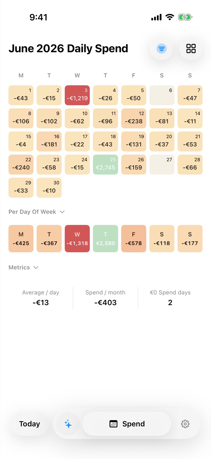
A spending heatmap is a month of days, each shaded by how much left your accounts that day. Dark days were expensive. Pale days were not. You can read a month in about half a second, without reading a number, which is the only reason anybody checks it daily.
The colours are relative, not absolute
Here is the thing worth understanding first, because everything else follows from it.
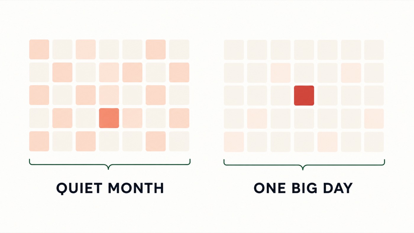
A day is not dark because it crossed €150. It is dark because it was heavy compared with the other days you are currently looking at.
Pocket Pivot finds the heaviest spending day on screen and treats that as the top of the scale. Every other day is shaded in proportion to it. There is no fixed euro threshold anywhere in the app.
This has a consequence people notice immediately and find confusing for about ten seconds: the same day can change colour as you scroll. A €60 Tuesday looks middling in a quiet month. Scroll to a month containing one €900 day, and that same €60 barely registers. Nothing changed about the Tuesday. The comparison changed.
This is deliberate. A fixed scale would ask you to have a stable opinion about what €150 means, which depends on your income, your city, your rent and your month. A relative scale asks a question you can always answer: which days stood out?
The four things a cell can be
- Neutral. Exactly nothing happened. Not a small amount. Zero. A run of these is the most informative thing on the calendar, and we come back to it below.
- Spend. Money left. The shade runs from light to dark as the day approaches the heaviest day in view.
- Income. More came in than went out. Payday is usually the one obviously different cell in the month.
- Future. Days that have not happened yet, drawn faintly so they do not read as zero-spend days. An empty future is not a good month.
Reading the shapes
Once the colours make sense, patterns fall out of the grid on their own.
- Vertical stripes. The calendar starts weeks on Monday, so each column is a weekday. A dark column means a weekday problem, and Saturdays and Sundays sitting in the last two columns is the single most common pattern anyone finds here.
- One dark cell in a pale month. One day contributed much more outflow than the surrounding days. Tap it and check the transactions before deciding what it means.
- A dark block of three or four days. This may reflect an event such as a trip, move or visit. Compare another period before calling it a recurring trend.
- Gradual darkening across the month. Outflow increased without one obvious day dominating. The transactions underneath show whether the pattern is meaningful.
What a run of neutral days is telling you
People assume a string of zero-spend days is the goal. Sometimes it is. Often it means something less flattering and more useful: the spending moved. A week of pale days on your main account, in a month where the total did not drop, is not a week of restraint. It is a week when you paid with the other card.
This is precisely why the calendar merges every account you connect into one grid. A quiet week that is genuinely quiet looks the same either way, but only a merged view can tell you which one you had.
Pick a tone you can actually read
Colour perception is not universal, and neither is colour comfort. Pocket Pivot ships five palettes. Soft Sorbet is the default, and the calmest. Bold Pop is the easiest to read at arm’s length. Traffic Light is the plainest: green is money in, red is money out, with no interpretation required.
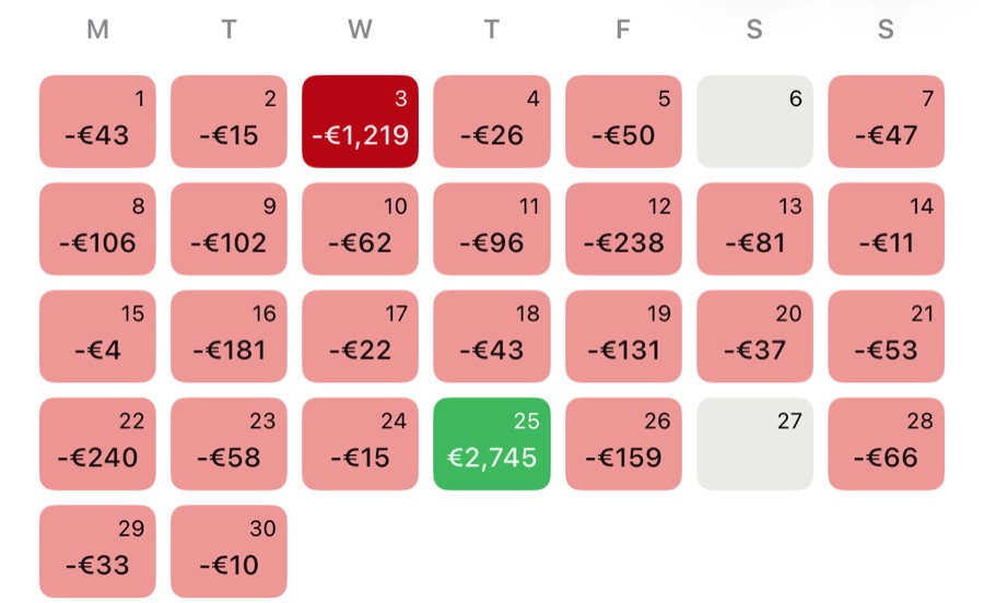
If the colours are hard to separate, the map is worthless to you. Switch tones until a heavy day is obvious without squinting. That is the whole test.
The one thing worth remembering
You are not reading amounts. You are reading contrast. The question the heatmap answers is not how much did I spend? Any bank app will tell you that. It is which days were not like the others, which is the question that has an answer you can act on.
See your own month this way
Pocket Pivot opens with sample data, so you can read a heatmap before connecting a bank.
Get the launch emailPocket Pivot is a spending-awareness tool. Nothing here is financial, investment, tax or legal advice.